Headstart

Gateway to Beauty
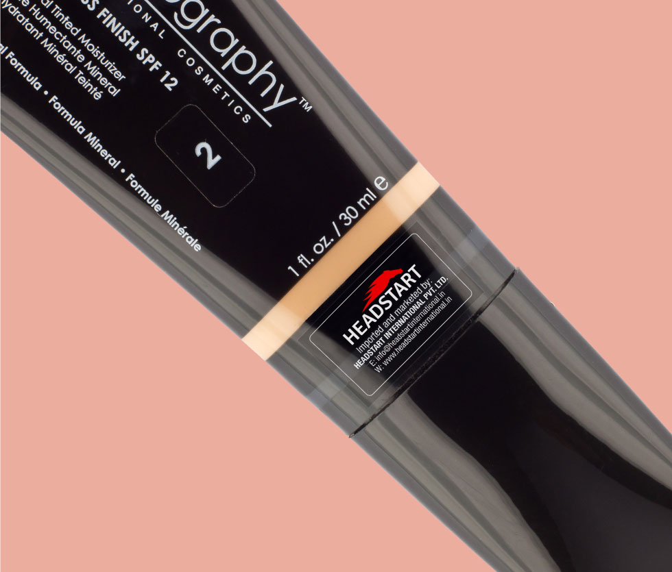
In todays’ fast paced life everyone wants to look good and wants to do so within minutes. This is where one of my client excels, Headstart International Pvt. Ltd. They have a keen sense of fashion and identifying products that will appeal to the ever changing customers. Headstart identifies products from all over the world and hand picks best of the lot, to be imported to India.
Their core business is creating a market for premium cosmetic brands in India. Their main imports come from Australia, France, Germany, United Kingdom and U.S.A.
Project Details
Client Headstart
Date March 2015
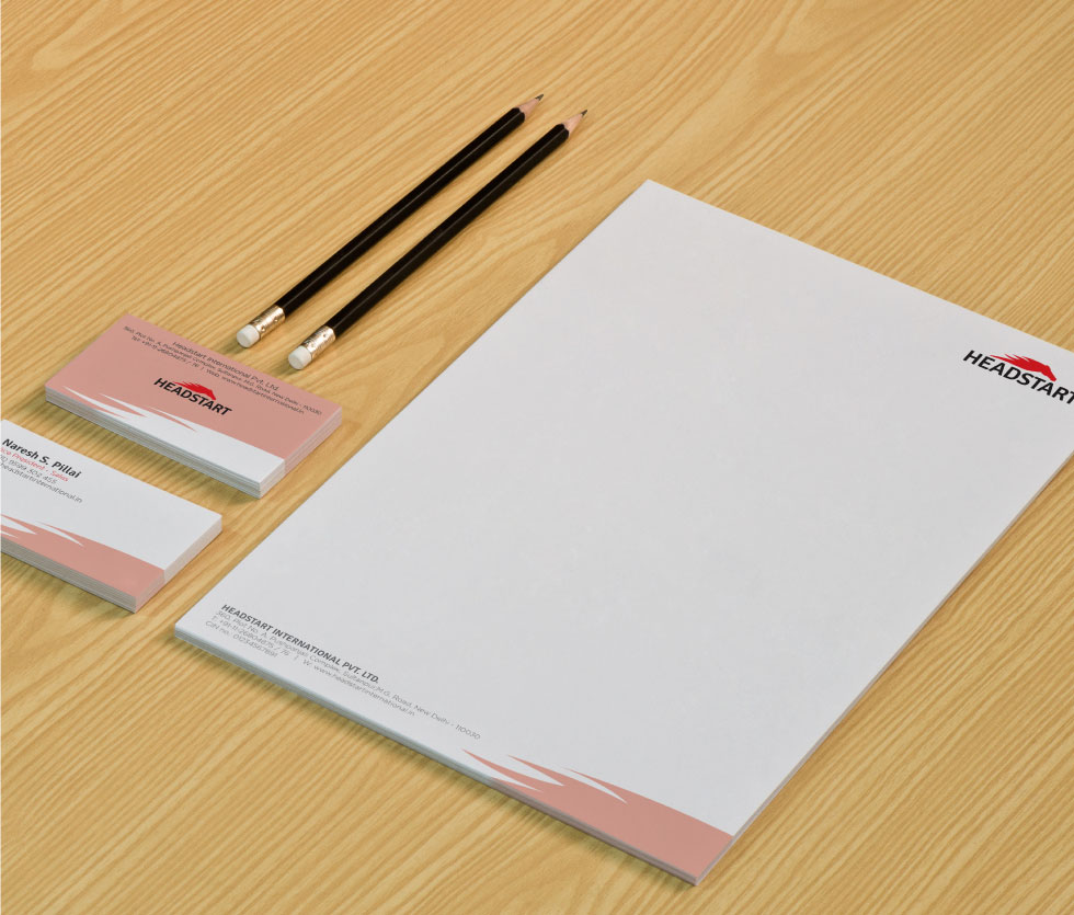
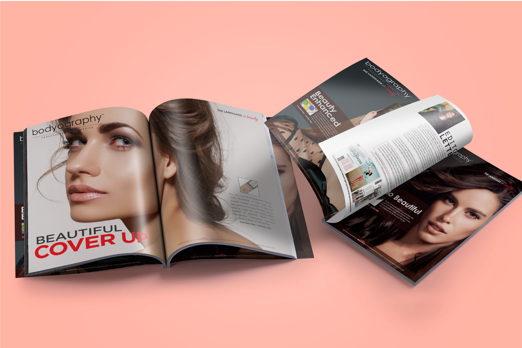
Work Brand Identity, Logo & Wordmark, Adverts (Magazine)
“Beauty is in the eye of the beholder”
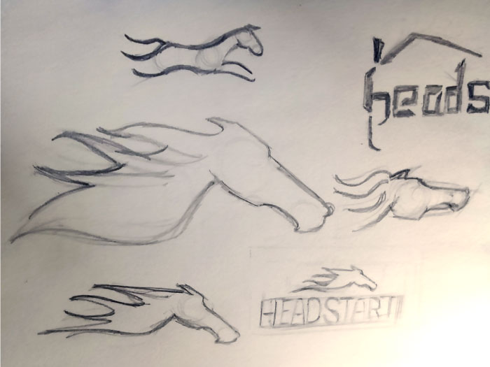
It was my first day at the agency and I was asked to redesign the logo for this fashion brand. I was excited and a little jittery as I know the need and importance of a good logo. I followed my gut instincts and started working on the design.
Research paves the way
As in any work preparation is the key to success. I started my research regarding the industry and usage of the logo on the product and other merchandise. I wanted their logo to demonstrate and relate to their name “Headstart”.

Typography matters
As you’re selling beauty products, the choice of typography needs to be fashionable too. Just as the symbol of horse, the typography also had to emanate strength and beauty. I found that ‘Signika’ type was perfect for this purpose. It has similar glyphs as ‘Calibri’. The straight thick stem shows strength while slightly tapered corners show softness and adds beauty. The horse mnemonic with extended curled mane in red sits gracefully on top of the type.
Let's talk about you
I'm always looking for inspiration. Let's talk about your work.

Get in touch
I would love to hear from you about your work. Let's start a conversation.