Our first brief was to analyse and present three examples of Good design and three poor designs. We were free to critique them and were suppose to study them thoroughly so as to face the cross-questioning session. So here are my 3 good and 3 poor design examples..
Poor Design 1: So much advanced technology, why can’t that reflect in the bathroom sinks
When I moved to UK in September, everything was new to me. Its surprising for me (a guy from India) how easily the people here adopt the new technology, and use it in their daily lives. Almost everyone I saw in the small town of Epsom, use their credit/debit cards at super markets. More so, they also use the self-checkout counters. Something that you can use to scan your own shopping and pay for with your card.
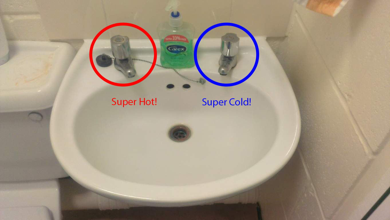
Everything is pretty much automated and self-sustained. Yet, in my University Accommodation and also at a lot of other public toilets, I saw this wash sink.
- Found almost everywhere in Great Britain
- It may either burn your hands or just give you a frost bite
- You can mix the hot and cold water in the sink.
- But its not very hyginic, is it?
- After you’ve done, finish by cleaning the sink and burning or freezing your haind, again..
This British sink is found almost everywhere in Britain. The most annoying thing I find about it is the two taps which are far apart from each other. One burns your hand with super hot water and other gives you frostbite with super cold water. I think the intention behind this design was to get people to save water. So if you want to wash up your face, you use the plug on the drain and mix hot and cold water in the sink. But after you’ve done washing, the water is dirty and just for the hygiene reasons, I will never consider reusing that water.
Innovation:
This piece of innovation is what surprised me. Its just literally 50 steps away from my University accommodation, in the University Cafe toilets. Basically its just one tap, with controlled flow of water. The more you move the tap-head counter-clock wise, the hotter the water gets. It basically solves two problems:
- Gives you water that is just enough warm to touch in those freezing winters.
- Reduces the wastage of water with controlled flow. You try wasting water and you end up wasting your own time.
This tap is just a.. well…….. innovation!
- Move counter clock-wise to get hot water, to your liking.
Poor Design 2: Laundry from the HELL!!
When I moved to UK in the University accommodation, I was a bit puzzled about doing my laundry. The accommodation people handed me a big piece of paper showing detailed instructions on how to do my laundry. Well the laundrette is situated on campus, literally right next door. But the problem was to get started. This is why Circuit Laundry made it to my Poor design list.
Clearly, the instructions were not detailed enough and I had to go and talk to accommodation office to understand the whole process again. So, I’ll try to be as clear as possible in explaining the whole procedure.
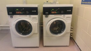
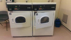
The Laundrette next door to me has two washers and two driers each.
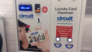
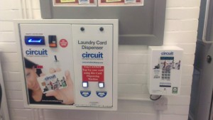
But before you take all your clothes there for washing. You need a pay as you go card, because none of the washers and driers accept cash. So, the card machine is located inside the campus building, right next to the caretaker’s office.
Before you insert any money in it, please be aware – the machine dispenses only £5 worth card, irrespective of what cash you put in it. But it will not accept anything below £5 (I’ve tried that).
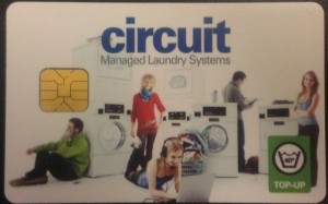
So, now that you’ve got the card,
you think you are ready for washing? Wrong!
You are ready if you don’t wish to dry your clothes in the drier, and don’t mind your small room smelling like detergent. The machine takes £5 and gives you a card with only £3.50 credit in it. The washers take £2.60 minimum to wash and driers take £1.10. So, you are still £0.20 short. Oh i wish the driers took cash. So, now you get to use your credit card!
Log on to circuitcardtopup.com and top up your card.
Make sure that you have chosen the right spot for card top-up or you will have to travel to another campus, or college just to top up ur card. After you’ve paid, the website will give you a code, write it down on a piece of paper. It should ideally also mail the code to your registered email address, so, if you can access that email on your phone, then no need to write it down.
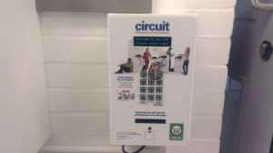
Now, go back to the card machine. Right next to it is a smaller card top up machine.
Insert your card in the machine. Bend uncomfortably as if you were sitting on an invisible chair. Now, insert the code you’ve written down, or from your email. The card will be topped up with the credit. Now, you’ve got enough exercise and successfully topped up your card, you shall now be able to wash your clothes.
Good luck with your laundry.
Poor Design 3: Context Menu in Windows (Yes! PC is not perfect)
Laugh all you want Apple users, but when it comes to efficient working, I feel that PC is faster to work on. All because of its neatly designed and properly segregated right-click on the mouse, and some really cool keys on keyboard. However the context menu that the right-click of the mouse triggers is not perfect, and in my opinion could’ve been better.
So when you want to change the name of a file, you right click on the file-icon and click ‘Rename’. But sometimes, people often click on ‘Delete’ accidentally and the whoosh! The file disappears. The file now exists in the recycle bin. Typically, you’d have to open recycle bin and ‘Restore’ the file and try again. But, it does have a workaround. You can left-click on the file once and press F2 on your keyboard.
But I propose a slight change in its layout:
This way, while you try to ‘Rename’ a file icon using a right-click context menu, you might accidentally click ‘Cut’ but that should not make your file disappear. And it saves you time.
Good Designs
In my opinion poor designs are easy to spot as they would just get in your way. But a good design is hard to spot as it is supposed to be invisible to enable your transition from problem to solution seamless. So, the next part for me was rather difficult.
Good Design 1: Entertaining Donation Boxes
If you’ve been to McDonalds in London, then you might have noticed those small boxes on the counters with loads of coins in them.

Typical donation box. It just takes that heavy change in your wallet, so you don’t have to carry it along.
They collect this money for the children with families hospital. You can find more information here: www.rmhc.org.uk
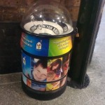
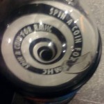
But McDonalds decided to take it one step ahead. On the McDonalds at Waterloo station in London, I found this:
This new design, allows a bit of play. You can throw a coin in there, and it does a swirl action around its top rim part before going in the storage unit at the bottom. This serves two more purposes:
- It entertains the children, as they ask for more coins from their parents to put in it.
- As children are entertained, it collects more money for the children in need.
I think it is a superb innovation in design.
Good Design 2: A restaurant with menu for every allergy.
There is a restaurant near London Eye, named Ping Pong. It serves good quality Chinese and Japanese food. Their website is www.pingpongdimsum.co.uk. I’m allergic to eggs, so when I went there, I made the same clear to my waiter. He immediately pounced upon the opportunity to give me an egg free menu instead. I was astonished to find all their dishes filtered out especially for me. The waiter, upon seeing my inquisitiveness, proudly said that apart from eggs-free menu, we also have, nuts-free, glutton-free, shellfish-free menu, Vegan menu and so on.. We have about 50 something menus for all different allergies and preferences. This looked like an amazing design idea to me.
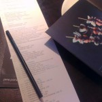
Not only this, they have a long menu, so you don’t get confused, they have check-boxes next to the items on menu, and they give you pencils so you can mark the item you want to have. How cool is that. See the pictures below.
- Mark your items in check-boxes
- List of Menu items with a picture catalogue, to give some idea what the items look like.
- This menu was meant for me
- Treat for Vegetarians
Good Design 3: Library from the future!
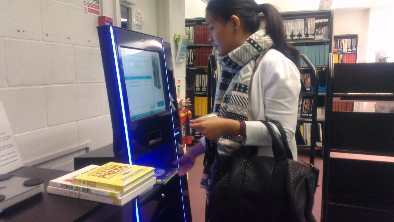
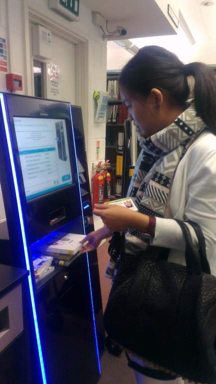
Coming to UK was a big change for me. Even bigger, when I saw the Library at University for the Creative Arts. Its futuristic approach just blew my mind. Here’s how you use the automated borrowing machine at the library:
Step 1:
You go to the library and look for all the books and DVDs you want to borrow. We Post-grad students are allowed to borrow a maximum of 30 items at once. That’s more that we can carry, I think. So once we’ve found items we want to borrow.
Step 2:
Find the borrowing kiosks and scan your id card to login (sounds cool huh..)
Step 3:
Keep the books in the rack provided in the machine. It will automatically detect the items you have placed there and show you the last date of returning them. Once you follow the procedures on screen, all the items are now borrowed by you in the system. So you become responsible for them, until you return them using the same procedure.
If you want the machine can print or email receipts for all the transactions you make.
Step 4:
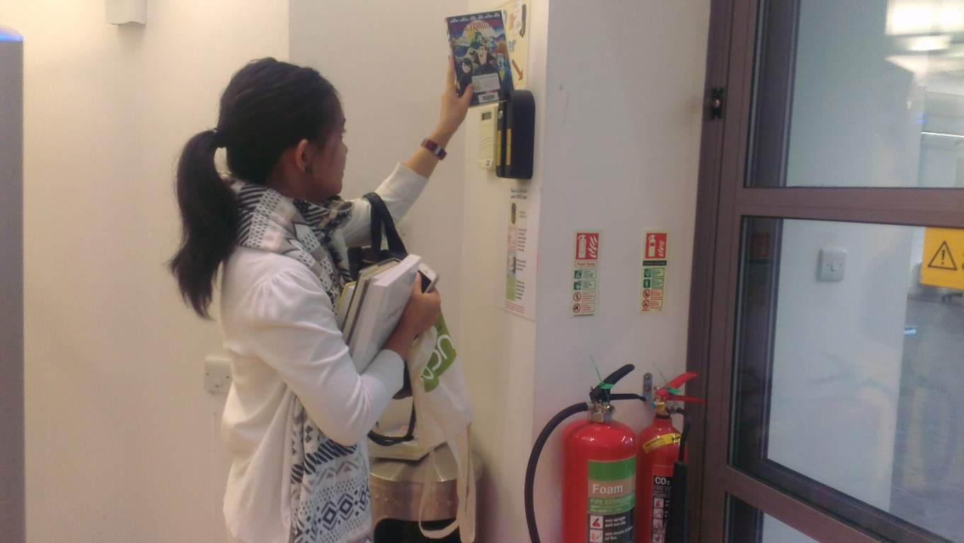
Don’t forget to unlock your DVDs from the un-locker located near the exit door. And yes, if you try take any item out without borrowing, alarms go off and you get caught, which is.. well embarrassing.
I think the system is very efficient because it knows who has borrowed the item, when is it expected to be returned. If the item is found damaged, system know who borrowed it last. The DVDs are locked until you are inside the library because they can be easily damaged. Also, there is so much IT involved, its possible you might get stuck somewhere. You can ask the librarians/student services people sitting on the desk right next to the kiosks for help. The automated Kiosks, helps them focus on student services more.
That’s a library from future!
You can see my actual presentation below:
[slideshare id=28862450&doc=design-20review-131203192729-phpapp01]

